SignWarehouse proudly stands by the performance capabilities of each printer we sell. However, we understand the frustration expressed by customers when the color of their prints don't match that shown on their computer monitors.
There are a lot of factors explaining why this may be the case, and the solution may be as simple as calibrating your computer monitor. However, we believe the best way to hit your desired colors is through a process we call "Match by Output."
STEP 1. Download the Pantone© Color Chart, and move the file from the download folder to your desktop or preferred folder.
STEP 2. Open the downloaded EPS file in SAi software (Flexi or LXi Rip), and click the RIP/PRINT icon. Production manager will open.
STEP 3, In production manager, click "SETUP," and then, "DEFAULT JOB PROPERTIES." Then, go to the Color Management tab (third tab from the left), and click the "ADVANCED" button. There, select "No Color Correction" in the Vector, Text, and Gradient fields. Click "OK" twice.
STEP 4. Send to printer by clicking "SEND" in the RIP/Print window.
NOTE: Flexi users can skip Step 5 as the desired swatch is already installed.
STEP 5. Download the Pantone swatch (.zip); and move the extracted folder to the swatch library folder found within the Vinyl Express Program folder (Program folder -> SignWarehouse -> Vinyl Express LXi-> Swatches -> Libraries).
STEP 6. In SAi design software (Flexi or LXi), click to navigate through View, Color, Open Table, Swatch, Library, and then, Pantone. Select the "Pantone Solid Coated" swatch. The swatch should now appear at the bottom of the design window.
STEP 7. Compare desired color with the printed Pantone© chart and note the description code of the most accurate shaded square.
STEP 8. In software, create or import vector image and then click the swatch shade consistent with the color code noted from printed chart.
Additional Information
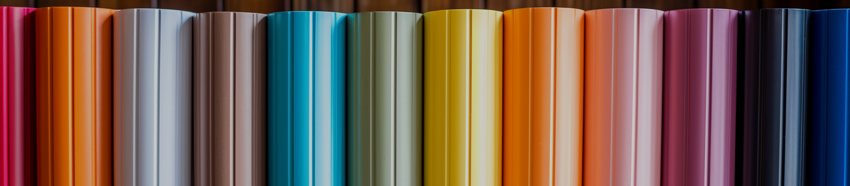
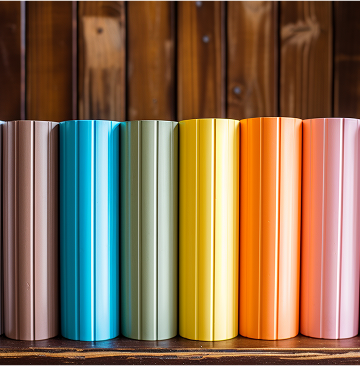
- Print and hang a different chart for each media you typically use once or twice a year.
- Monitor and maintain room temperature and humidity level of printer's immediate environment.
Q&A
- Why adjust color management setting before printing the color chart.
- Changing the rendering intent to "No Color Correction" will achieve a more consistent output than the "Relative" or "Perceptual" settings.
- Why printout a swatch if my client already knows the desired color's Pantone© color code?
- Not all clients will know the Pantone© color code they'd like to achieve.
- The customer may reference a color code that yields unintended results when printed with your printer.
- How can I use my printed color chart to match colors with a client at a different location.
- The best way to insure proper communication of colors is to both purchase the Pantone© Color Bridge and print the Pantone© color chart. Then, if the customer cannot bring or send you a sample to match, she can reference the color code as seen on the Pantone© Color Bridge. Use your color bridge to locate the color and then find the most comparable representation on your printed color chart.
Downloads
- Pantone© Color Chart (for print)
- Pantone© Swatch (for software)