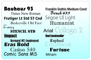
They're all around us. Right in front of us in fact, every workday. They're like cellular phones. We see them every day, but there are important things we don't know about how they work. What are these ubiquitous sign tools? Fonts of course. Because we see and use them daily, we all think we understand them, but few of us have a complete grasp of what sign making fonts can do and how to make the most of them. Recently, an experienced sign maker who had upgraded their software was distressed when they saw that doing so had altered the sign making fonts in their existing designs. However, they were relieved to find out that their issue could be solved by understanding more about the nature of fonts. Once enlightened, they were off and running and 20 years of work was returned to its original design. The experience made me think about others who possibly have encountered the same situation. What is it you don't know about fonts and how is it hurting your workflow?
Types of Type: Different kinds of fonts

The first thing we should know is that there are different kinds of sign making fonts. There are different font families, categorized of course by style, but in addition to how they look there are important differences in how they work. There are, different types of type. Let's look at the different kinds of fonts, then we'll briefly examine the different classes of fonts by appearance.
Since most people working with fonts today do it digitally, it's important to realize that there are different kinds of computer files that drive these characters on our screens. The most commonly used today are Open Type and TrueType fonts. In the early days of desktop publishing and computer aided sign-making (CAS) these fields developed independently and sometimes competitively. Makers of desktop publishing software like Adobe and Corel used Type 1 and Postscript fonts.
The sign industry took a different tack. In order to build value for its users, most CAS makers included proprietary font libraries with their software. Scanvec's CASmate came with Casfonts, and Amiable's FlexiSign came with its proprietary FSFonts. When Scanvec and Amiable Technologies merged in 1999, CASmate, Inspire and Flexi users got software pre-loaded with Casfonts and FSfonts. These files remained the standard fonts in SAI software through Flexi Sign version 7. They're still available, but today FlexiSign also comes with True Type and Adobe fonts. The Casfonts and FSFonts can be added, but they're no longer the default.
True Type advantage.
What are TrueType fonts? According to Adobe.com, True Type fonts are based on a shared format developed by Apple computer in the late 80's, then licensed to Microsoft for free. The low price was designed to make sure of a wide adoption rate. Since they use a standard format, True Type fonts are fully compatible with any Windows or Mac graphic design or word processing application. This provides advantages for file sharing, and collaborative design, both within your business and between you and your customers and partners.
Open Type.
Adobe and Microsoft continued to cooperate together on the development of OpenType, which has evolved into an open source standard. One of the advantages of Open Type is it supports storage for 65,000 characters. The keeps some fonts designers from having to release two fonts for additional characters. Both the The older True Type and the newer Open Type are interchangeable, as open type fonts can be saved as .ttf formats. Both Macs & PCs will read both formats.
Platform problems.
Speaking of fonts and file sharing, this is easier now than it used to be. In older operating systems, MAC and Windows versions of the same type faces work differently and are therefore not interchangeable. A change made in Apples OS10 operating system has removed this hurdle so Windows and MAC PCs can now share True Type font files. So if you're designing something for a customer or print service provider using a MAC OS9 or earlier computer, you may have to convert the font before sending the file. More on that later.
Engraving fonts.
Type faces that work great for printed or plotted images don't always translate to the related field of awards and engraving. Standard fonts work well when cutting acrylic signs, but are not suitable for scribe engraving names on trophy plaques. For this application, you need single line, or "stroke fonts", which are also included in FlexiSign. These are also popular for use in rhinestone garment decoration because they allow decorators to articulate letters with fewer stones and lower cost.
Common Sign Making Font Problems & Solutions
- Loss of continuity with software upgrade. As noted above, SAI switched from Casfonts and FSFonts as the default choice with the advent of Flexi Family version 8. Customers upgrading from an earlier version may find that their old designs suddenly go haywire when opened. This is because the embedded fonts aren't there. This can be fixed by simply copying the CASfonts and FSfonts folders from the installation disc to the intalled folders on your SAI Production Suite, which should be found on the hard drive among the Program Files folder (C:\Program Files\SAI Production Suite). Once the Casfonts and FSfonts folders have been copied, you should be able to open your old files and see them as they were originally designed.
- Loss of continuity from one PC to another: A related problem occurs when you design a graphic using a font that is installed on your PC, but then have to print or plot it on a different PC that doesn't have the same font. There are two solutions here. The first is to simply send the font to the other computer or user so that it can be installed on the computer from which the file must be printed or cut. If that's not possible, you can convert the font to outlines before exporting or saving the file. This will convert it from an editable font to vector paths in the design. The advantage is, it will look the same no matter who opens it. The disadvantage is, once it's been converted to outlines, the text can no longer be edited. It's a good idea to check the spelling before converting to outlines, or save the original file with the embedded fonts as a backup.
Sign Making Font Design Basics
Once you've learned to manage fonts across PCs and platforms, there are a few things to keep in mind as you work with them in your signs and graphics. These simple tips will help you produce effective, professional quality signs.- Kerning and Leading. Don't assume the default spacing your keyboard spits out is the best arrangement for your design. Adjusting the space between characters is known as kerning. This extra step makes words more legible and allows them to work together as links in a chain. Leading is the vertical space between horizontal lines of type. This too should be adjusted to optimize logical grouping of letters , the balance of positive and negative space, and legibility of the overall design. Remember that signs are not effective unless your customer's message is easy to read. Sometimes this has to be done in a few seconds from a moving vehicle. Fine tuning kerning and leading will distinguish your designs, giving your customers the best chance to succeed...and grow into repeat customers.
- Font selection: There are basic guidelines for the effective use of fonts. Using more than three or four fonts in one design can cause confusion and clutter. Different fonts have different functions and they should be used to augment one another. Use bold San Serif fonts for headlines and thinner san serif or serif fonts for small type. (Serifs are the small ornaments on the ends of characters, like the small circles on the ends of the capital T in Times New Roman. See Fig 1 above). In addition to using serif and san serif fonts appropriately, try to choose type faces that fit the context. The most famous such gaffe in recent memory was that of Cleveland Cavaliers owner Dan Gilbert, who was ridiculed for sending an angry message to departing NBA star LeBron James-- in Comic Sans. The careless choice of such a whimsical font undermined the gravity of the intended message. Likewise, using an Old English font on a banner announcing a recreational event targeted at teenagers would be just as clumsy.
- Be aware of design trends. Staying abreast of trends in graphic design and typography keeps your work relevant, and helps market your customers' businesses more effectively. One current typography trend is combining thin and bold san serif fonts in a headline or product name. Juxtaposing thin and bold produces contrast, which is one of the four basic elements of good design. For more on improving your use of type, contrast, and related design tools, please click here to view our Basic Guide to Sign Design.
Further reading:
A Brief History of Digital Type Font Formats: Article from Adobe.com Choose the Right Fonts for Your Next Sign Job


