We had a customer call recently and state that they couldn't get a "true blue" or a "true red" from their digital printer.
Of course, the logical follow up question is, true to what? In other words, what were they comparing the color that came out of the printer to?
Having been in the sign industry for many years, I do know that it is very possible to design an object you can’t print. This can be maddening for sign makers and digital printers, especially if you are new to the process of digital printing.
This frustrating phenomenon generally befalls people who are making the transition from cut vinyl (spot color) to digital (process color). The color range used in vinyl and heat press applied films is entirely different from the output available from a standard process inkjet printer. Most new printers assume the range (or color gamut) is the same between cut vinyl and digital color printed on white vinyl. They struggle with managing their own and their customers’ expectations.
There is no reason to fall into this trap. Find out what your digital printer can and can’t do and learn how to manage expectations toward higher customer satisfaction. Grab a cup of espresso and settle in for Color Space 101.
LAB, RGB, CMYK
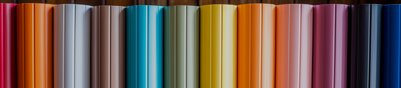
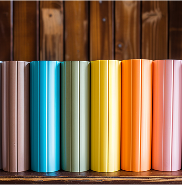
The term “color space” refers to a defined set of hues associated with a given technology. Not all methods of delivering color are fully compatible. Some have a broader range of hues, some narrower. Since graphic designers use different kinds of color spaces, often within the same project, it’s important to understand what they are and how they differ. The three basic color spaces we deal with in the digital graphics industry are LAB, RGB, and CMYK.
LAB: LAB, also referred to as CIELAB, is derived from various technical definitions of color relating to lightness and opponent colors. The LAB space represents all colors visible to the human eye and is independent of the device used to produce the hues. It’s the broadest of the three color spaces we’ll refer to here. It's not used much in the Sign marketplace.
RGB: RGB is an additive, light based color used for stage lighting and computer monitors. It’s named for its primary colors, red, blue and green, which combine to make white light. It’s important to understand the basics of RGB even if you’re not a stage manager because your graphic design application may offer you the option of designing in RGB or CMYK.
While not as broad as LAB, RGB is a larger range of color than CMYK. Some software applications sold in the sign industry default to RGB in order to allow designers to start with the broadest possible gamut and therefore, the most vivid possible output. Adobe applications expand this difference by computing a much larger color space computed from LAB values to produce Adobe RGB, which is significantly larger than the standard srgb.

CMYK: CMYK is a subtractive, pigment based color space comprising combinations of cyan, magenta, yellow, and black inks. Since these inks are the standard colors for offset and other printing processes, they are commonly referred to as Process colors.
Process inks work by subtracting specific wavelengths from reflected light, causing a color shift similar to that seen when light is fed through a prism. The pigments in cyan ink remove a different part of the spectrum than those in yellow ink. When cyan ink is applied to a white substrate, the light that reflects off the substrate through the ink has a portion of its total spectrum removed, causing it to look blueish. Different blends of these four inks, laid down in droplets on paper, produce the myriad of colors used in process printing. For this process to work properly, you have to start with reflected white light. This is why all process printers need to print on white media or lay a white under-base to decorate non-white substrates (like black T-shirts or clear static cling).
As noted above, CMYK is the smallest of the three color spaces discussed here. It’s slightly smaller than sRGB and much smaller than Adobe RGB. The RGB values that cannot be duplicated in CMYK are identified as “out of gamut” colors. These include vivid “candy apple” red, navy blue, orange, and bright green. Pastels in smooth gradations, such as those seen in (Caucasian) flesh tones, can also be problematic.
Manufacturers of high resolution indoor inkjet printers address these limitations by adding inks that broaden the gamut, reducing the range of out of gamut colors. Some Epson and Canon printers come with up to 12 inks including red, orange, or violet inks. Unfortunately, many of these are aqueous inkjet printers and aren't suitable for printing long-term outdoor graphics. As expanded eco-solvent gamut printers come into the sign industry, we'll update you on what's available.
If you don’t happen to have an expanded gamut printer, don’t despair. Good old CMYK is still pretty versatile. All the printed catalogs, brochures, magazines, etc in your house are produced with these same four process colors. Some advanced piezo electric print heads use variable droplets to produce smoother gradations in pastel colors. So don’t throw up your hands and quit. Just learn to use your equipment properly with smart design and sales procedures.
Spot Color vs Process Color
Vinyl and heat transfer film uses spot color. That means the Cardinal Red vinyl is the only color you're going to get out of that roll. Many of the spot colors you’ve been using in vinyl and heat transfer film can be duplicated in CMYK. Keep in mind that vinyls like ORACAL #564 Light Navy and #334 Fire Brigade Red may be out-of-gamut colors. Also be aware of the fact that metallic finish vinyls won’t translate unless you have a printer using metallic ink. The most popular spot color option is white ink, which is used to serve as a white substrate for process color prints on transparent and non-white substrates. White ink is most commonly used in UV-LED printers for decorating rigid substrates like plaques.
The other common spot color challenge for digital printers comes from customers requesting prints that match Pantone colors. Pantone is a commercial color standardization system especially useful for corporations who want to manage their brands and logos across various reproduction technologies. Pantone Matching System, or PMS colors have specific numerical values that make it easy for designers and printers around the world to standardize color. Because of color shifts caused by differences in coated and uncoated media, the PMS system offers values for both. For instance, the PMS values for the golden yellow in McDonald’s golden arches are 123C for coated media and 109U for uncoated. So why is this nifty system a problem for digital printers? The Pantone system is based on a combination of an expanded digital color space and spot colors composed of proprietary Pantone inks. Both of these are much larger than the CMYK color space. Pantone’s Hexachrome color space consists of CMYK plus orange and green. Pantone’s spot colors number over 1,100, most of which are outside the CMYK gamut.

How do you know if the Pantone color your buyer wants is beyond your printer’s gamut? And if so, what do you do about it? Use the Pantone Color Bridge guide. The Color Bridge is a list of common PMS colors with corresponding color swatches that shows the closest possible match in the CMYK space and provides the specific CMYK values for that color. Using the Color Bridge can relieve you of hours of trial and error, and reduce wasted time, ink, and media. It’s also handy for getting pre-approval from the customer if his or her target is out of gamut. Show them the printed CMYK equivalent and ask if that’s good enough. If they say yes, your risk of having them reject the finished work after design, printing, and finishing is much lower. If they say no, at least you’ll find out you can’t satisfy them without having to waste valuable time and materials.
Color Chip Chart
The Pantone Color Bridge is essentially a product specific “chip chart”. You can achieve the same effect and reframe your customers’ expectations whether they’re citing PMS numbers or not. You can create your own chip chart- and it will be even more accurate than the Color Bridge-- because it will come from your printer and be printed on your media. Simply generate a field of color swatches in your design software using the appropriate ICC Profile for your most popular media, and print it. Then, display it in your lobby or show it to customers during the design and approval stage so they will know what to expect. For a helpful tutorial on how to do this, please refer to our Match by Output video on the Tech Support blog.
Once you learn to design and sell within your printer’s gamut, you can avoid some of the most common pitfalls of the transition from vinyl graphics or CAD shirts to digitally printed signs and apparel. The widest possible gamut is the best. But the world of process color printing is still very large. A good CMYK printer can produce high quality images for all kinds of profitable applications. You just have to know its limitations and design within its color space so you don’t frustrate yourself or your customers. Then you’ll have more time to ponder the great mysteries of the cosmos-- like how you to satisfy every customer every time, and where socks go when they disappear from the laundry.