We've all seen them. Badly designed signs on storefronts, banners, and vehicles. These bad signs remind us that having a vinyl cutter doesn’t instantly make someone a professional sign maker.
At SignWarehouse, we believe strongly that your success is our success. Helping you succeed is our job, our profession and our passion. To succeed in the sign business, you need to build repeat business. To do that you need to create vinyl graphics that produce value for your customer by communicating effectively.
To help you do that, we present A Basic Guide to Sign Design for Sign makers. There is no way we can cover all the sign design topics in just one blog post, and many of these explanations are over simplified, but maybe this can give you enough information to get you pointed in the right direction.
The most common mistakes newcomers to vinyl graphics make result in poor legibility. These include bad kerning (more on this later), poor color choices, too many fonts, and insufficient contrast. All of these add up to a sign that takes too much time and work to read. My pet peeve is seeing signs with yellow letters on a white background. Who can read that? Remember that most signs are seen as people pass by, often at high speed and distance. A sign design can look great on your monitor, stunning on the sign blank, but be utterly worthless from across the street.
Let’s talk first about the basics of good sign design: contrast and spacing. Then we’ll cover intermediate principles like font management, color management, and the Joshua Tree Principle.
Basics: Contrast and Spacing
Contrast

Contrast is one of the first keys to effective sign design. It’s what sets the main element apart from the related information. Contrast is how you make sure your sign attracts attention. It’s also how you ensure your customer’s name and essential contact information are communicated, even if you only have the viewer’s eyes for a few seconds. Effective contrast is a must and can be achieved in several ways. Two of the easiest are use of contrasting fonts and colors.
Fonts
Arrange the fonts in your sign so that there is a distinct contrast between those used in the main message or headline, and the related, secondary message. This can be done easily by contrasting the font size, style, and weight. Headlines should be set in larger fonts. Bold san serif fonts, are best for this. Although contemporary design favors thinner rather than bolder fonts, using a much larger font size for the headline is still an effective way of setting it apart from the body copy. Secondary info should be set in a smaller, and perhaps entirely different font. Tertiary information (details about the offer or promotion) should be set in a smaller, serif font.

Serifs are the little ornaments or strokes at the end of letters. (This post uses a serifed font.) San Serif fonts, like Verdanna used in this sentence, are missing those decorations. Serifs make smaller text easier to read. So if you have to place a paragraph of text (like this one) in your design, use a serif font like Times new Roman or Garamond to make it more legible.
Mixing up font styles, sizes, and weights is part of the process of getting the reader’s attention, communicating the essential message quickly, and then guiding them through the rest of the information. But too many fonts or styles make the sign look bad, a mishmash with no clear hierarchy.
But first, you have to get their attention. If the reader is driving by a banner or billboard, or viewing a graphic on a passing vehicle, you have only seconds to communicate a message. That is accomplished by using larger or bolder fonts to magnify the basic information which is usually the business’ name, phone number, and/or web address. Most customers want way too much text on a sign... your job is to talk them into simplifying.
Color
Choosing high contrast colors helps the sign grab attention and get read quickly. Black on white is of course maximum contrast. You don’t have to revert to black text on a white background. You can also use white text on a black background defined by a box or rounded rectangle. That gives you two levels of contrast: one between the headline and the smaller elements in the sign, and the other with the reversal of positive and negative space in the headline. Speaking of positive and negative space, that takes us to the second of our two basic keys.
The Yin and Yang of Positive and Negative space

Good design manages the balance between positive and negative space. Positive space is defined by letters and images. Negative space is what’s around and between those images. Think of the ancient Yin and Yang symbol. (Fig 4) It’s a perfect balance of positive and negative space. What would it look like if the whole design were black? It would be nothing but a circle with no meaning. The negative space gives meaning and context to the positive. Good sign design does the same thing. Managing the negative space between and around the graphic elements makes it easier for readers to interpret the message. The most common design errors regarding spacing are failure to manage the negative space between letters: (kerning or the lack thereof), and cramming so much information into the layout that there’s not enough negative space to organize the content.
Kerning

Kerning is the negative space between letters and numbers. When we type or use graphic design applications, the software applies a default space between characters. This is okay for documents, but makes for less effective graphic design. The need for kerning arises because all letters are not created equal; in width that is. A capital ‘O’ takes up a lot more space than a lower case ‘l’ so if you place the word Ollie on a sign blank, there appears to be too much space between the l’s. It’s a little distracting and degrades the legibility and effectiveness of the sign. Adjusting the kerning so that the thinner characters are closer together makes the word a more visually cohesive unit that’s easier to recognize and read quickly. All good sign and vector graphics software has kerning tools. If you’re unfamiliar with them, take a few minutes to learn how they work. Your signs and banner will be better for it.
Proximity and White Space
Beyond managing the negative space between characters, good sign design requires a balance of negative space in the overall placement of elements. Don’t fill the page with text and graphics, even if your customer wants you to. Resist the client’s desire to dictate a cluttered design that will make the end result less effective. Try to group related pieces of information more closely together with enough negative space around them to make them easy to find. Spreading all the various elements evenly around the page may seem like the logical thing to do, but it discourages reading because the amount of information overwhelms the reader. Grouping related pieces of information in tight clusters makes the design more inviting and easier to digest.
Intermediate Sign Design: Tips for Further Refinement
Font management

In addition to choosing san serif and serif fonts to optimize contrast, there are a few other keys to good font management. Too many different fonts on one page causes visual confusion and degrades legibility. Try to limit the number of fonts on one design or page to three at the most, and two is even better. When possible, use related fonts or font families with lots of options of variations in weight and style, rather than three or four different type faces. Frutiger is a good example. (Fig 7) It’s a san serif font that comes in several variations ranging from thin condensed to extra bold. Use of such a richly varied font family can give your design a uniform and organized look and still provide the variety you need to emphasize essential design elements.
Color management

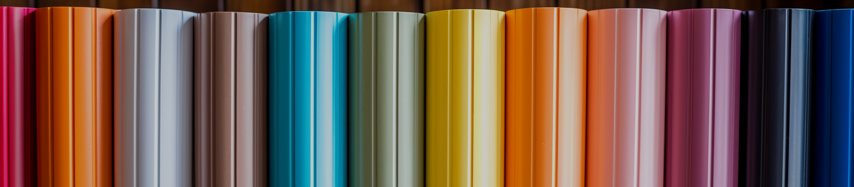
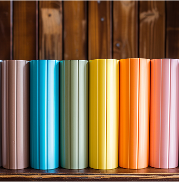
In addition to using high contrast colors, try to use colors that work together. Generally speaking there are two types of color groupings; analogous and complimentary. Analogous colors are those that are adjacent to one another of the color wheel. Some examples are red and blue, blue and green, green and yellow, or red and yellow. These are all analogous color combinations that work well together. Pairs of colors from opposite sides of the color wheel are called complimentary because they compliment, or intensify one another. These would be red and green, purple and yellow, or blue and orange. An easy way to see this effect is to place the same swatch of red on a green background and a blue background. The red on green looks “redder” than the same hue on blue. If you want to maximize the visibility and impact of a color in a headline of a graphic, put it on a background of a complimentary color.
Just say no to CRAP!
A good way to bring these elements together is to use the Joshua Tree Principle (discussed in the Non-Designer’s Design Book by Robin Williams–not that Robin Williams–available from Amazon.com). This principle organizes the elements of effective design in four steps: Proximity, Alignment, Repetition, and Contrast. I like to reorganize them from PARC to CRAP. It reminds me how not to produce crappy graphics. A thorough explanation of these rules is a little beyond the scope of this newsletter, so I suggest you check out Robin Williams book for more details. To find more information on basic sign design, including kerning and layout, I recommend picking up a copy of Mastering Layout by Mike Stevens.
Now you have a few more virtual tools in your sign making tool belt. Remember that the best way to build business is to help your customers prosper. And the best way to do that is by selling them legible, well designed, effective signs and graphics.