- Consider the audience. The audience will determine what kind of language you use on your sign. For example, if you are designing a sign that will be used primarily targeting consumers, you will want to plunge full force with something buyers can relate to. However, if you are designing a banner for a trade show, you are going to want to approach the task from the business mind, and create a fresher, crisper, more technically accurate sign.
- What type of sign is it? Will it be hung from an awning? Will it be wrapped around a vehicle? No matter how the sign will be used, you want to keep the design simple enough that it can be transferred to other sign options. Remember, you want the sign to stand out, but to be simple at the same time - that is the mark of a truly good sign.
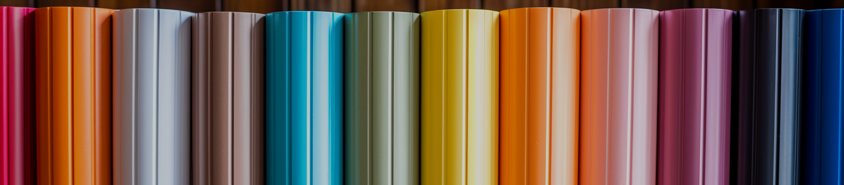
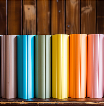
- Use color and contrast. When your sign has contrasting colors, it automatically stands out a little bit more. It is easy on the eye and more readable when then colors are similar. Stumped on what colors to use? Black and white is always a classic standby. If you're looking for something a little more... colorful, then bust out your good, old-fashioned color wheel and pick two colors on opposite sides of the wheel.
- It's a large graphic, treat it like one. Don't treat your sign like a print ad or a business card; it is made to be seen by people who are moving. Avoid using lots of text that will crowd the sign and be distracting and difficult to read. Use a logo that looks good small and large, and run with it. Branding your business with a logo that people can recognize is definitely worth at least a thousand words.
- Less is more. Make every word count, and keep the design simple. Simple designs may involve more complex design techniques, however we refer to them as simple because that is how the eye perceives them. Work to keep your designs clean and neat, and you'll be making fabulously effective signs in no time at all.
5 Sign Making Design Do's
For most of us, starting out in the sign industry may have seemed pretty easy. 'How hard can it be?' you may have thought. While throwing up some letters on a board and sticking it to a post may actually make a sign, it is far from what professional sign makers do. As you become more emerged in the industry you have likely realized that the truly great sign makers produce designs that are classic and original at the same time, which is no easy feat. Our goal as sign makers is to make signs that brand companies, attract business, and are aesthetically pleasing. Essentially, sign making is all about communication. Is your sign shop in the practice of following these 5 sign shop do's?